The art of typography
How do you choose the right fonts for your brand?
28.12.2022
Choosing a font can be tricky. Fonts can be beautiful but also complex, given the wide variety of options available. What's important is that your font choice(s) result in good readability and align with both your brand and target audience. In this blog, we'll provide you with handy tips for choosing the right fonts for your brand, starting with the basics of typography.
What is typography?
Typography is the art and technique of arranging type. It is used in the design of various communication materials such as websites, apps, posters, flyers, or social media posts. In typography, there are two main objectives. First, all text should be easily readable. It's crucial that the reader can see and understand everything clearly. The second objective of typography is to create the desired atmosphere that attracts the right target audience. The atmosphere should align with your brand.
Main types of fonts
Generally, there are two main types of fonts: Sans serif and decorative fonts. Sans serif fonts are modern, slightly bolder, and highly suitable for eye-catching headings. Two popular Sans serif fonts, for example, are Arial and Helvetica.
Decorative fonts are the opposite of Sans serif fonts. Use these fonts sparingly, for instance, when you want to add character to your designs by highlighting a beautiful quote, core value, or unique selling proposition (USP). Avoid using decorative fonts for longer texts (body copy) as they often have poorer readability.


Readability
The combination of different fonts and the chosen typefaces within them should form a readable whole. We're talking about readability in terms of the design of the font itself, whether it's Arial, Helvetica, and so on. Consider factors like stroke width, the presence of serifs, and the ease of distinguishing one letterform from another. The easier it is, the more readable it is. Decorative fonts are less readable because they are primarily designed to be seen at a glance rather than read in full. Fonts used for books or newspaper articles require very high readability. The trick is to create overall readability based on the specific function of the text.

Readability is influenced by factors such as font size, line spacing, and font colours. Together, they form a typographic style that is readable to a certain degree. It's important to note that readability should always take precedence over style.
Tailoring typography to your brand
The chosen fonts should align with the aesthetic expectations of your target audience. For example, if your brand operates in the financial sector, the audience often expects a powerful, dignified, and stable font. Frivolous fonts would not be suitable in this case. The better the fonts match the core essence of your brand's message, the more positively your audience will respond to it.
Using multiple fonts
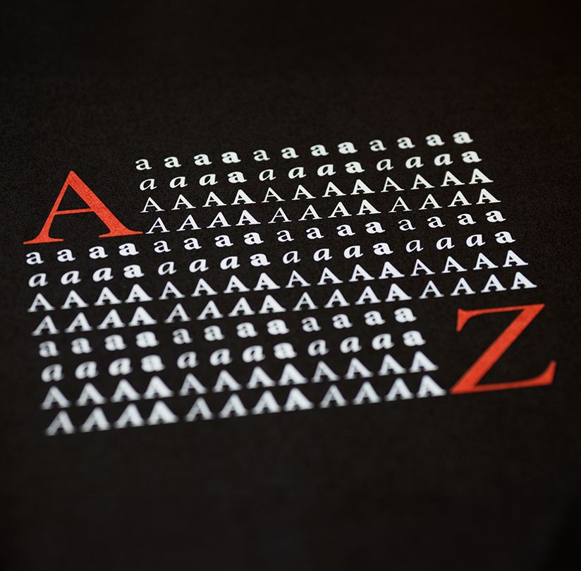
When designing a website or any extensive document, it's wise to choose multiple font styles within a font family. For instance, a font like Arial has various styles, including Regular, Italic, and Bold. By using a versatile font with multiple styles in your brand's materials, you can easily create consistency and order throughout your communication. At the same time, you create enough visual variation to emphasize certain texts effectively.
Now that you have defined a primary font for your brand, you can also add a secondary font. Try to choose a font that is distinct from the primary font while complementing the overall design. Keep in mind to limit yourself to a maximum of three different fonts in all your communication materials.
Need our help?
If you require help in developing or revamping your brand's visual identity, we offer comprehensive branding services from start to finish. From logo design to advice on colour, font, and imagery, to the creation of style elements and a communication grid that provides a solid framework for your campaign materials, we cover it all.

Curious about our creative approach?
Then, please contact us.


